

 |
 |
Vocational training • October 2008 - February 2009
| As some of you may know, we bought a chalet last summer from our good friends Ramsay and Heather. This Autumn we had some time off, and hadn't completely run out of money, so we thought we would reconfigure/remodel the kitchen and learn a little bit about the French national pastime of "bricolage" at the same time. One of those.... "would we have dared if we had known....?" kind of things.
|

Before we started, Mark drew up a model of what we had in mind using an amazing program called SketchUp. It took weeks for him to measure everything that had to be included in the drawing, such as the house, location of windows, all the appliances and cabinetry. The design went through several changes, but the above was what we ultimately settled on. In the end we were a bit surprised at how similarly it resembled the finished kitchen (see the last photo on this page). |
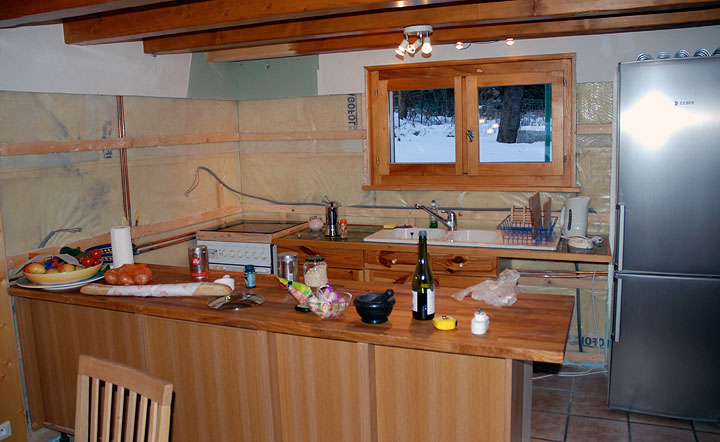
We don't have photos of the "before" state; honestly, it was quite cozy and not at all unpleasant. A perfectly good kitchen! But the layout and lighting were not ideally to our taste, it was a bit too closed in, various appliances were due for replacement, and the functionality could be improved. So in we dived. In this photo, we have already done the nastiest and dirtiest part of the work, which was to rip out the dark-green tile-work and the wall behind it (bare area), and to cut down a high-ish divider that previously existed where the foreground temporary butcher-block counter now is. This used to be shoulder height, and more completely closed off the kitchen area from the dining area. Also there was a vertical post (cosmetic only) on its right-hand side. This admittedly rather huge new refrigerator (by European standards) replaces a smaller one that lived off to the right under the stairs, and a dishwasher to the right of the sink has been removed. Our plan is to replace the stove and oven, and move them to a new position facing into the dining area. We also wanted to replace the sink, add some upper cabinets on the left, and include some stone elements to the counter tops and back-splash. |
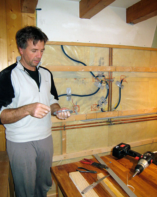
Here Mark is re-configuring the wiring for the new lighting he has designed. Plug and switch outlets now have to go on, as well as new wall-board. |
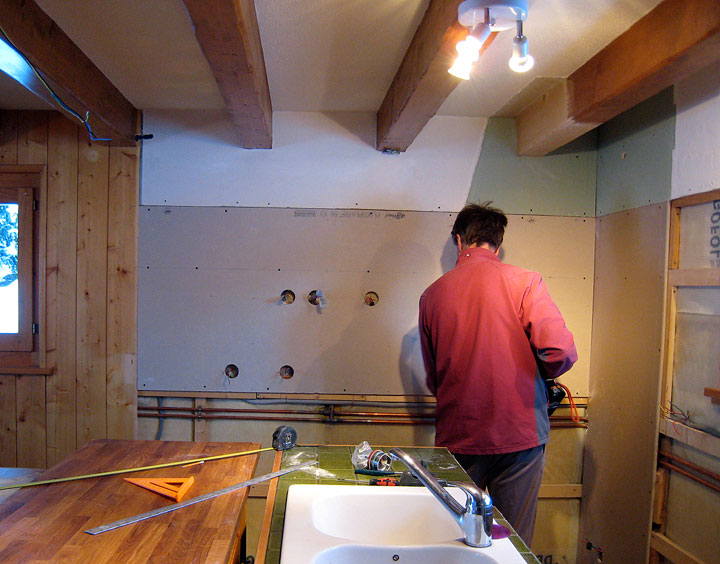
The new wall-board going in.... |
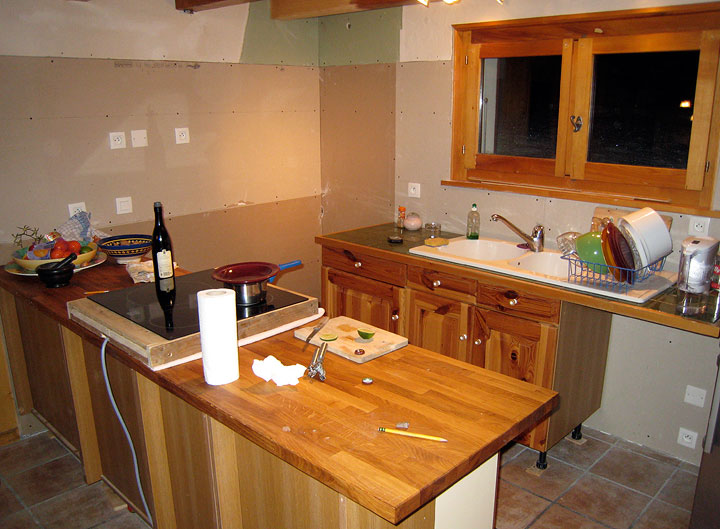
The wall-board is in and the switches in place. Each day, after working, we have to clean up and put the kitchen back together to cook. To facilitate this, Mark has built a little portable frame around our (amazing, new) stove top (induction, it's magic!). We're still on the old cabinets. |
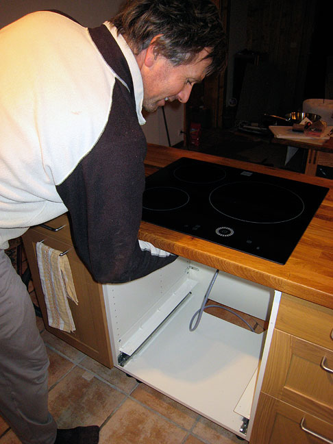
OK we've skipped ahead quite a lot, making it look much easier and quicker than it was!. Christmas visits intervened, but when we got back we built all the new lower cabinets, and put the new dishwasher in place. Mark cut out various holes in the counter tops to fit them together, to receive the tile slabs, and also, finally, for the stove-top. Here it finally settles into its permanent position, for good. |
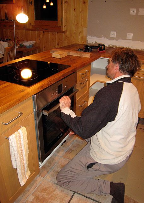
Ditto the new oven. |
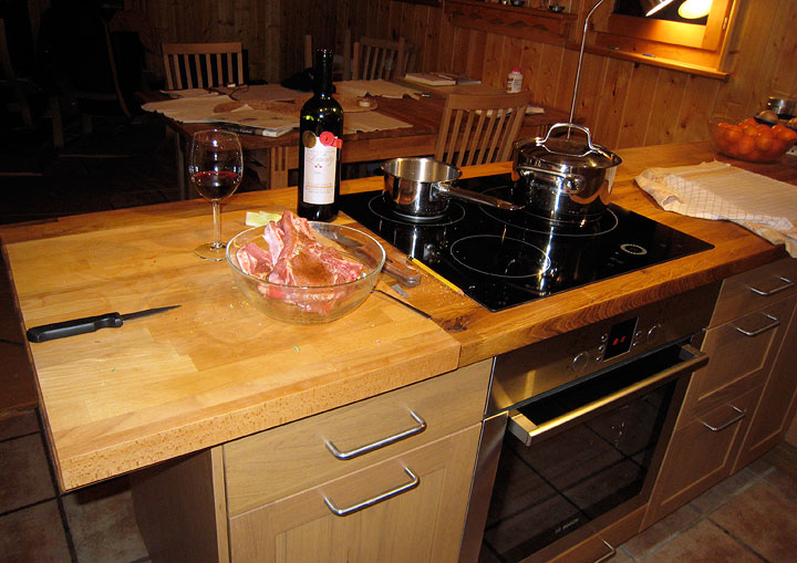
Ahhhh! It's nice to quit moving things back-and-forth every day, and to have a functioning oven again. Now for the tile slabs... |
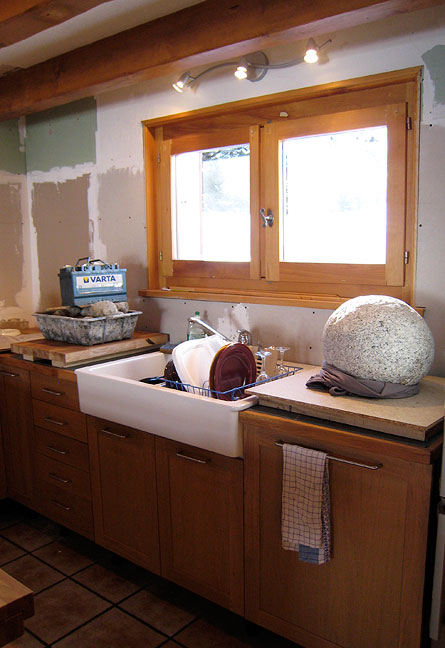
After a false start, we discovered the proper way to glue down big tile slabs. We found the right kind of sticky stuff and the right method of application (not that obvious, at least to us), and laid them in. Just to be sure, we gave them a bit of weight while they set up. |
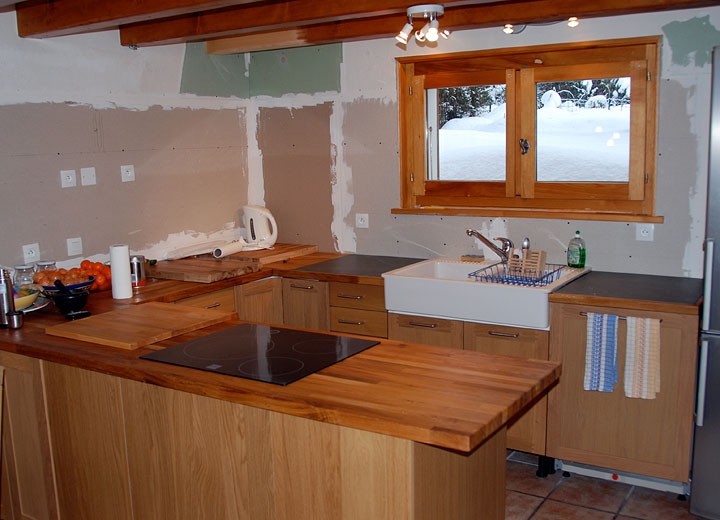
The tile slabs are in place, glued and calked. |
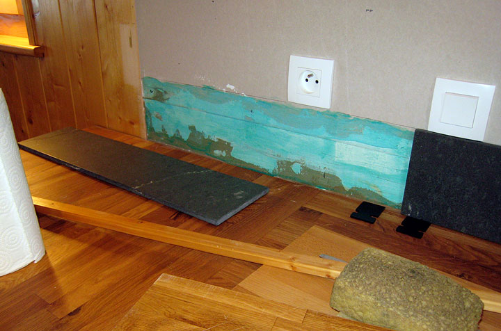
After scary careful cutting of two of the big tiles into the correctly dimensioned strips for the back-splash (we had no extra of this rather expensive, specially-ordered material to work with in case we goofed!), we glued and caulked them in as well. |
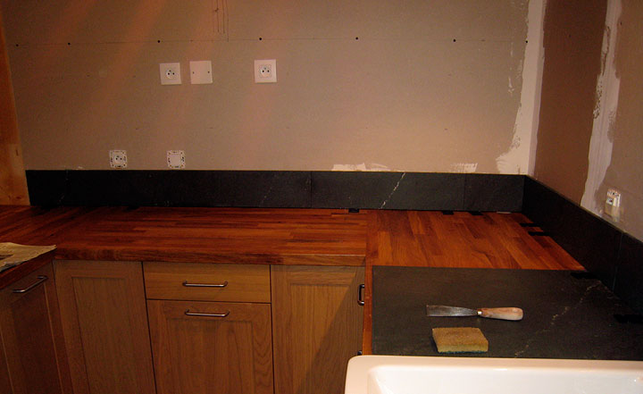
It's a relief to get that done without mishaps. |

Meanwhile some mundane but time-consuming tasks such as installing new overhead lighting (not shown), and plinths ... |
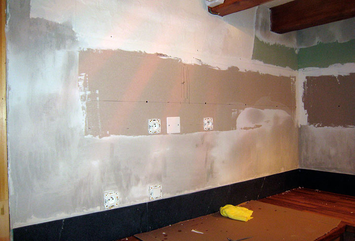
Another tricky, hard-to-plan-for bit we're glad to have done: re-plastering the wallboard in preparation for painting. |
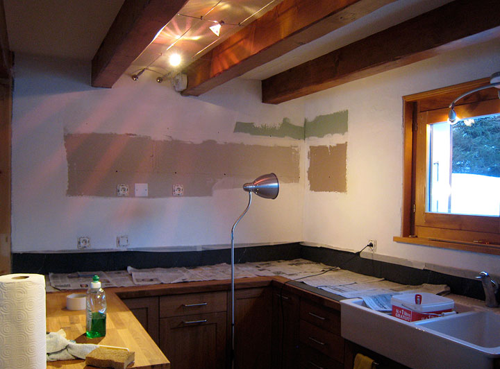
Plaster is applied where needed, dried, and freshly painted, now ready for the upper cabinets to go in. |
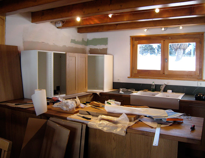
Almost done now... |
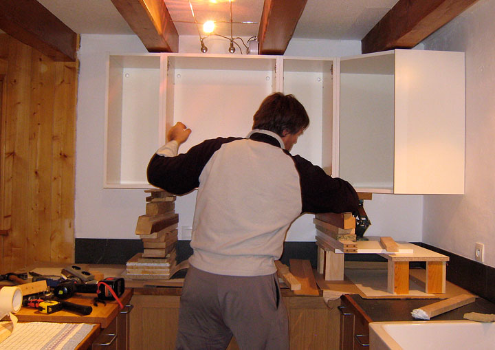
Heavy hummers. That's a car jack by Mark's right elbow. |
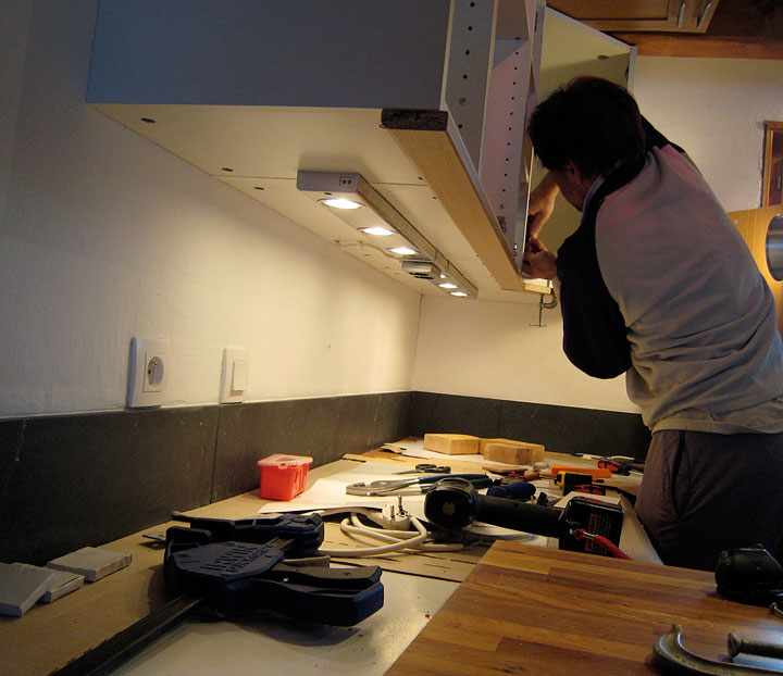
The under-cabinet lights go in... |
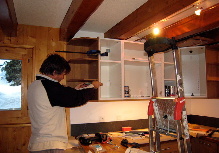
End units... |
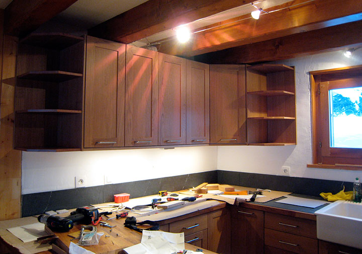
Et voilà! |
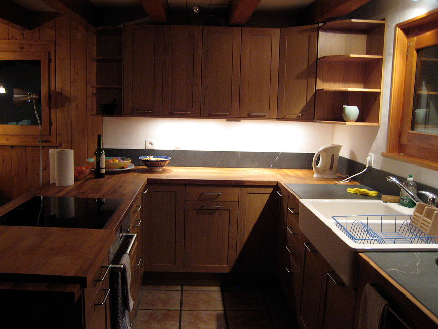
Everything is finally in place! Yikes, that was a lot of work! |
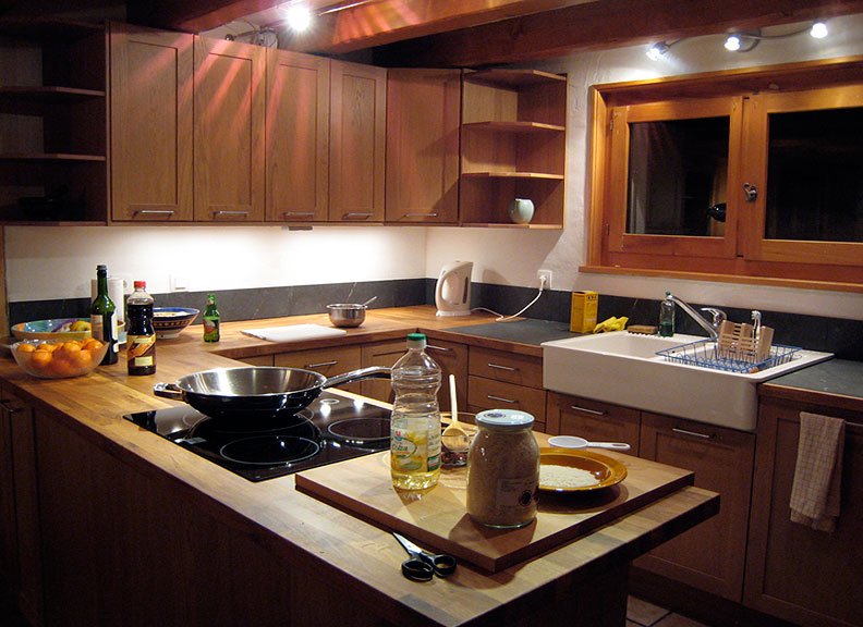
Time to celebrate with a first meal cooked in the new kitchen. Our customary celebration dish; Gung Pao Ji Ding! (I know, not very French). |
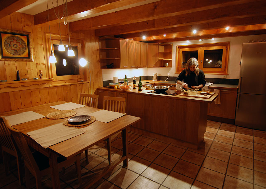
Kathy can certainly see what she's doing now (so can everyone else, for better or for worse!) |

Hooray! |
All images, layout and text ©2009 Cosley & Houston Alpine Guides, All Rights Reserved